UX case study · 2024
One workspace for nonprofit operations.
Nonprofits manage operations, fundraising and internal communication across tools that don't talk to each other. NPO Connect pulls that into one place — without adding overhead for a volunteer who isn't technical.
- Role
- Design strategy, wireframing, prototyping, high fidelity
- Team
- Six designers
- Method
- User-centred, iterated on testing
- Tools
- Figma, Photoshop CS6
Nonprofits run on scattered tools
A spreadsheet for donors, a separate calendar, email threads for volunteers. Nothing connects, so the same update gets entered three times and tasks fall through the gaps between systems.
The users are staff and volunteers — rarely full-time operators, rarely technical, always short on time.
User interviews
Three volunteers at nonprofit organisations, asked how they currently manage operations and fundraising, and how they coordinate with other volunteers.
What we heard
- A mix of disconnected tools rather than one system.
- Tracking everything is tedious — tasks get forgotten.
- Cluttered dashboard; hard to filter between campaigns.
- Errors updating and managing the website.
- Not accessible, not user friendly.
Defining the problem
How might we bring operations, fundraising and volunteer communication into one place a non-technical volunteer can use without training?
Every symptom traced back to one cause: there was no single home for the work.
Low fidelity
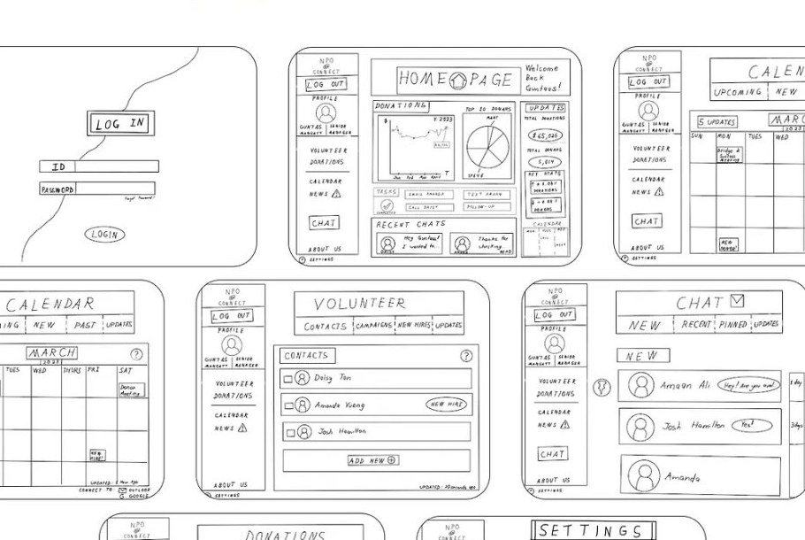
Every screen was sketched before any visual design, so structural problems surfaced while they were still cheap to fix.
Usability test
Measured: time on task, rate of success, rate of failure.
Scenarios: log in · find the news · message a volunteer · find upcoming events.
All three participants finished all four tasks. Two problems still showed up in every session.
- Two news buttons. One on the side dashboard, one in the middle of the page. Participants clicked both to work out whether they differed.
- Messaging was hard to spot. One participant scanned the screen for several seconds before finding it.
“I think this is the right button.” — the most repeated phrase in testing. Tasks were completing on guesswork, not confidence.
A third note was a request rather than a failure: make the calendar visual, so events are seen at a glance.
Entry and navigation
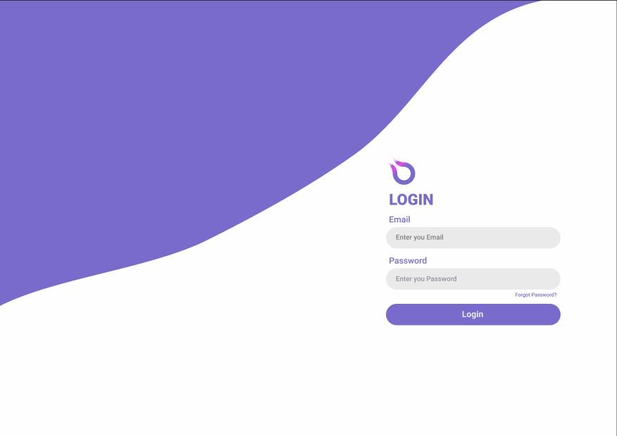
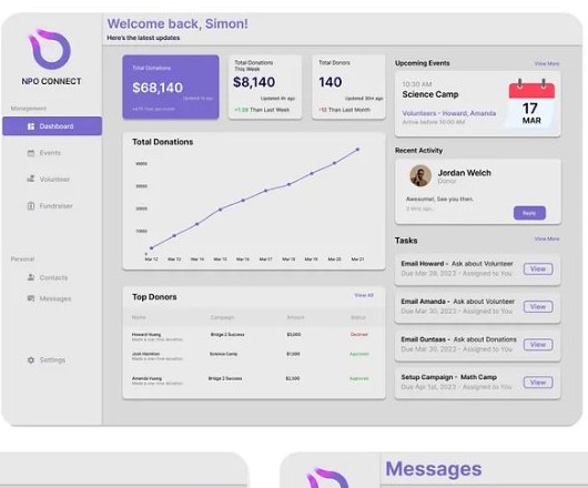
One sidebar, split into Management and Personal, so organisation-level work and a volunteer's own tasks stay distinguishable at a glance.
Calendar and fundraising
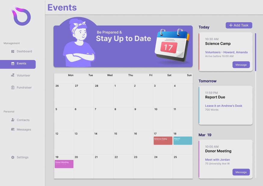
The calendar became a month view, answering the testing request directly — events are visible without drilling in, with today and tomorrow pulled out alongside.
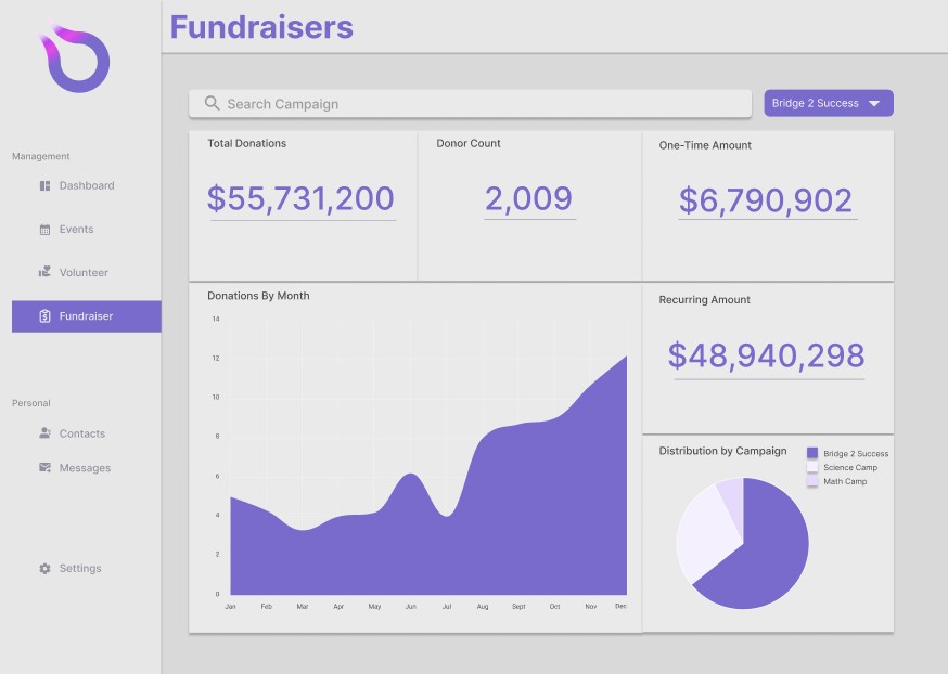
Fundraisers answers the “hard to filter between campaigns” complaint from the interviews: pick a campaign, and totals, donor count, monthly trend and split all recalculate.
Donors and settings
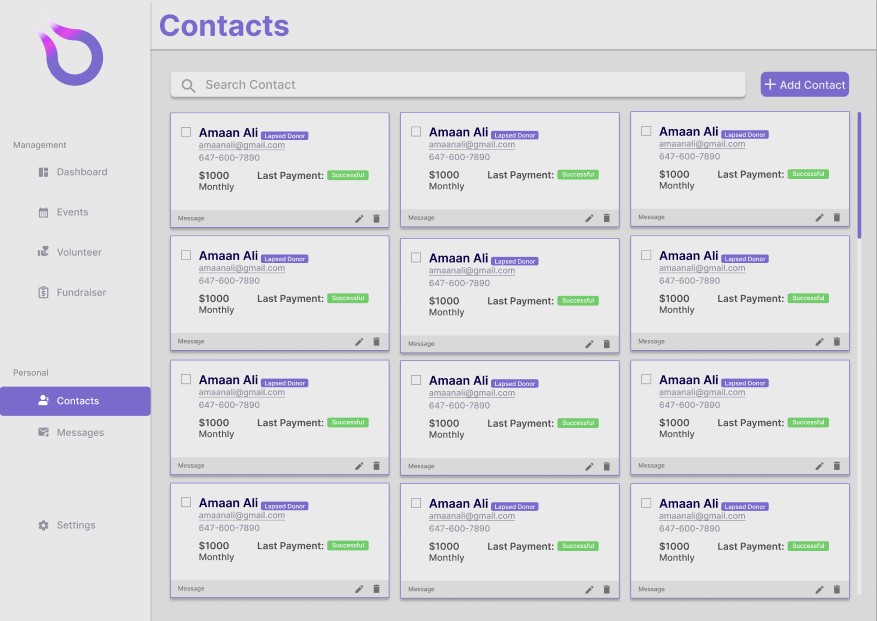
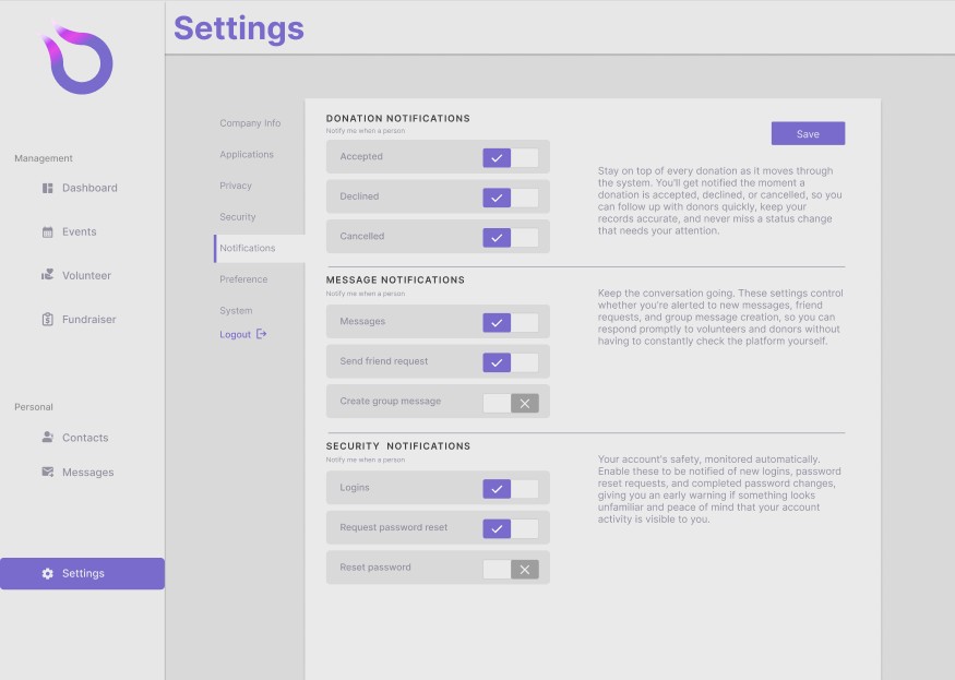
Contact cards carry the status a volunteer needs before making contact — lapsed or active, amount, cadence, last payment — with message, edit and delete on the card itself.
Next steps
Two news buttons looked harmless in the wireframe. It took watching three people click both to see the cost — which is the argument for testing structure before visual design.
- Retest the high-fidelity screens to confirm the hesitation is gone.
- Widen the pool beyond volunteers to full-time staff, whose daily tasks differ.